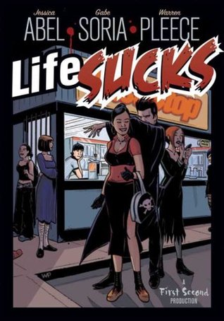
 Description: Life sucks for Dave Marshall.
The girl he’s in love with doesn't know he exists, he hates his job, and ever since his boss turned him into a vampire, he can’t go out in daylight without starting to charbroil.
Stats: Paranormal Graphic Novel, 192 pages, First Published by First Second, April 2008.
My Rating: 2 STARS
Life Sucks is a graphic novel that sells itself as a possibly interesting take on another vampire tale of darkness. This story is all about removing vampire lore from its classic romanticism and into some form of reality where you need to pay rent and stuff.
All of the elements here are very workable concepts, and I went into this wanting to like it, but it just fell flat.
I don't really have much of a response to the book. No honest hate, no enjoyment, no emotional connection to the material, no interest in the art, and only mild interest in the plot. I can say that the characters were by far the best thing about the book, but even then they just weren't enough to carry the entire story.
Speaking of art. That was definitely my low point, and very nearly made me dislike this completely. I'll start by saying the art has really good things about it: The colouring is vivid, there are a lot of small details, and it has some great panels. But these things can't save it entirely. The style does not convey movement well and I found myself getting bored with the limited array of facial expressions. Worst of all, the inability to have characters appear to be more than just stiff re-positioned figures, reminded me of barbie dolls. That is never a comparison you want to think, let alone read in a review, but it has to be written.
When rounding everything out, this turned out to be very "meh".
No comments:
Post a Comment