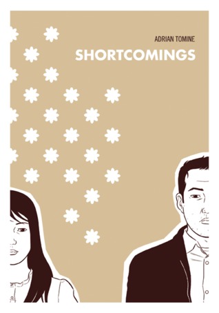
Description: Ben Tanaka, is a confused, obsessive Japanese American male in his late twenties, and on a cross-country search for contentment (or at least the perfect girl). Along the way, Tomine tackles modern culture, sexual mores, and racial politics with brutal honesty and lacerating, irreverent humor, while deftly bringing to life a cast of painfully real antihero characters. - Source Goodreads
Stats: Adult Graphic Novel, Hardcover, 108 pages, Edition Published by Drawn and Quarterly, October 2007.
My Rating: 1 STAR
I've spent a lot of time thinking about Shortcomings the graphic novel and trying to form a readable review. Turns out, I really didn't enjoy this. I actually wrote a review where I did a reasonably good job at explaining my dislike for what's done in Shortcomings in contrast with what the book was trying to achieve, but then it was accidentally deleted, so here I am back at square one with no interest in explaining myself again.
BUT I'm going to try!
Shortcomings is a character piece where you're not suppose to like any of the characters. You see, they're "painfully real" and that means they go around and act like dicks for the entirety of the story with no redemption or explanation as to their thinking aside from the fact that they're "flawed". There's also a lot of "brutal honesty and lacerating, irreverent humor" which means to say these unlikeable characters are unlikeable because they aren't afraid to push buttons and say things that are disrespectful in a flippant manner. Like that time where the lesbian character is cussing out a girl, who identifies herself as bi, by calling her a "face sitter" and a "dabbler". Wow, how edgy! Totally not afraid to say what they want to say. That's what makes them so real, you know. The fact that there so flawed. Just look at how flawed they are! The main character even calls this one guy he doesn't like "faggoty" in a fit of rage. I mean, wow, it just got REAL! Real and FLAWED! Aren't FLAWS just so REAL?
In the last year I've grown to have a new appreciation for the anti-hero. When characters do have flaws and behave in a way that isn't always likable, it isn't about having a positive or a negative reaction, it's about how their behavior plays into an interesting and engaging plot. Shortcomings isn't interesting. The entire story is formed around the characters insulting each other and whining. This results in a lot of drama, but not a lot of examination of the issues and ideas it's trying to bring to the forefront of the story about racial identity, sexual attraction, and frankly, anger management issues. Anything it was trying to say was overwhelmed by the blatant negativity and boring relationship drama that was the equivalent of something you could see in an edgy episode of Gossip Girl.
Shortcomings was trying to be off-putting and it succeeded, but I don't think I could say it succeeded in communicating any of the other points it was so desperately trying to get across. The only plus side was the art, which was amazing. I would love to see it applied to a less frustrating story.
Monday, June 30, 2014
Wednesday, June 25, 2014
Review: Geek Girls Unite by Leslie Simon
Description: In recent years, male geeks have taken the world by storm. But what about their female counterparts? After all, fangirls are just like fanboys—they put on their Imperial Stormtrooper Lycra pants one leg at a time.
Geek Girls Unite is a call to arms for every girl who has ever obsessed over music, comics, film, comedy, books, crafts, fashion, or anything else under the Death Star. Music geek girl Leslie Simon offers an overview of the geek elite by covering groundbreaking women, hall-of-famers, ultimate love matches, and potential frenemies, along with her top picks for playlists, books, movies, and websites. This smart and hilarious tour through girl geekdom is a must-have for any woman who has ever wondered where her sassy rebel sisters have been hiding.
Stats: Non-fiction, 208 pages, First Published by It Books, October 2011.
My Rating: 1 STAR
This did not go well. It certainly could have gone much worse, but it gets worse the more I think about it. Mildly offensive at best.
I'm sure Ms. Simon meant no harm. I'm sure she wasn't trying to insult me. But someone along the writing path needed to remind her of the sensitivity of her subject. How saying my jeans are "probably second hand or from Target" might be seen as an insult or how her humorous quips might be read more as jabs. How not all girls are the same and one geek is not like the others. We're not all unpopular, we're not all meek, we're not one thing. We don't all want beta boys because some of us don't even want boys to begin with. These obvious flaws could have been rectified by acknowledging the differences.
Part of what makes a geek a geek is that we don't fit a mold, we don't all have the same spots and stripes. Just because we like stuff doesn't mean it completely defines every aspect of who we are. This book makes some pretty bold assumptions and Simon backs them up by saying that she has created a community of geek girls called the "Geek Girl Guild" who she has interacted with.
"Women of all ages, backgrounds, and areas of geek expertise wanted to joined the sisterhood, making the first pledge class over one hundred strong!" - Introduction, page 5
(And yes, "joined" is a spelling mistake found in the book.)
It makes me wonder how many of those 100 women read this book after it was published and went ...Hold on a second. I will say that the most interesting part of the book for me was the quotes in the margins, some of which attributed to the non-famous, which I assume were taken from this group of women. These geek girls were happy, strong, and proud. Another positive were the small biographical paragraphs about various geek girls who have succeeded in there in field, change perceptions, or influenced geek culture. Those small elements were great to read and brought a smile to my face midst the frowning.
With that said however, lets talk about the frowning, and the scoffing, and the sighing, and the raging.
I went into this book going off the title alone. I thought that anything geek girl oriented might be interesting to check out. I was wrong. I could only force myself to read so much and in the end, to be completely upfront, I only read the sections of this book that applied to me and as I identify myself as a geek. I couldn't force myself to read anymore.
I read:
Introduction
Section 1: Fangirl Geek
Section 2: Literary Geek
Section 7: Miscellaneous Geek (because being called "Miscellaneous" is a confidence boost)
Conclusion: Geek Girls Unite
The other chapters are more in the same and I assure you were skimmed through diligently for the sake of this review. These are the sections that I will be going focusing on in depth.
Brace yourselves.
We are gathered here as the Geek Girls of the world. Those of us focused on in this book are labeled by interest: Fangirl Geek, Literary Geek, Film Geek, Music Geek, Funny-Girl Geek, Domestic Goddess Geek, and Miscellaneous Geeks, which are Tech Geeks, Fashionista Geeks, Political Geek, Retro Geek, and Athletic Geek.
The majority of this book, 99.9%, is about generalizing, quantifying, labeling, judging, assuming, and stereotyping who we are as people based off of a single interest. Now, this narrow-minded focus is bound to be exclusionary but things only get monumentally worse when Ms. Simon tries to apply humour to the situation. Her quips can easily be read as jabs, her silly throwaway pages easily read as insulting. At every turn there is another opportunity to judge and generalize, of course humourously. My glasses, my phone, everything is just another opportunity for a joke. To take one thing and boil it down to what that says about who I am.
Then there's is the FRENEMIES page near end of each and every section. Allow me to explain. Frenemies is a combination between "friend" and "enemy", or "frenemies". These pages are basically a list of people who you shouldn't like, or at least not hang out with, based on your geek cred. Because we're in middle school and these people are clearly not cool enough to be seen with.
Oh, you want some examples? Why, sure! Here some taken word-for-word from every section.
- Athletes.
- House guests who see your Sony PlayStation and ask if you live with a ten-year old.
- Anyone who cheated their way through high school and college English literature classes by relying solely on CliffsNotes.
- Members of the illiterati.
- Simpletons who are only familiar with the term "word-play" because it's the name of a Jason Mraz Song.
- Cheeseballs who still quote Napoleon Dynamite, Borat, or Austin Powers on a regular basis.
- Poseurs who admit to being "really into film" after seeing one Wes Anderson movie.
- Investment bankers, stock brokers, and various other Wall street douche bags.
- Girls who wear leggings instead of pants.
- Women who wear fragrances by celebrities.
- Know-it-alls who immediately launch into a "but is it art?" discussion after walking through a contemporary art exhibit.
- Eccentrics who wear holiday or Cosby sweaters unironically.
- Self-proclaimed artists who use paint-by-number kits.
My word! These people are clearly soooooo beneath us. Let us banish them from our cool table and make them sit with losers at lunch! Suddenly geek girls are exclusionary, mean, would rather judge then share our knowledge, rather jump to conclusions then laugh, and willing to completely shun a person based on a single trait.
This pisses me off! People like what they like! Why is it necessary to be mean to each other? Geek girls know better than anyone that people who don't accept others for who they are aren't worth being around. And the fact that Ms. Simon is encouraging this sort of behavior make me beyond angry.
Let us not forget the previously mentioned Geek Love Checklist section, which tells us traits to look for in the perfect geeky man for each section's assumed tastes. These pages manage to squeak by from my acceptance that I'm reading the same quality that can be found in your average $1.99 teen magazine. Till of course I saw this:
The Perfect Match For a Literary Geek Girl...
"Only reads one book at a time and thinks someone who's 'in the middle' of numerous titles displays commitment issues."
Which made me think this: Screw. You. Asshole.
... Remember how I told you that geek girls can be sensitive? The majority of us grow up being told what is normal, what is cool, what makes a girl desirable. If a guy said that to me, I'd get up and leave. Because I am a geek girl and I don't like elitism.
Then there was a bunch on small things that bugged me, which I will briefly list for your sake.
- The mislabeling of Harry Potter fanatics as "Muggles".
- The 18 Twilight references in the Fangirl section. (I loved Twilight when I was young, but this was a little much)
- The section dedicated to Twilight called "The Twilight Zone", which never even mentions the actual Twilight Zone. You know, the cult classic.
- Reading through the entire Fangirl section and not a single mention of "fandom", online communities, or Firefly.
- Reading through the Literary Geek section and not a single mention of "Young Adult", varying tastes, or a little word called "genre".
- The page title, "TAP THAT SASS". No thank you.
- The fact that the book lacks focus in the audience it is trying to appeal to.
- The way that the Literary Geek section list books/information about only adult fiction and some early juvenile fiction. I found this annoying because these were not the books that geek girls love universally. These books are books everyone should read eventually, but you have to hold an interest for them and they have to be at your reading level. When going through all the adult fiction it was like reading a list of books for a college course.
- And the section on the Political Geek Girl has this lovely little snippet:
"They strive to be advocates and activists; thus they often possess a pretty rigid set of values and ethics. (Some might call them stubborn or obstinate. Not me, of course, but some.) In an ideal world, everyone would see things their way." - page 172.
I'm just going to stop there.
I am a fangirl of epic giggly and badass proportions, fashion is my passion, music and film are my mistresses, and global politics is my dirty Sunday gal. But most importantly I am a literary geek who should warn all other such geeks to keep this book off their to-read lists. Not only is it not worth our time and money, but it is not worth the possible insult. As a girl, I refuse to be generalized. I am proud of who I am and that girl is not the geek that Ms. Simon thinks I should be.
Geek Girls Unite is a call to arms for every girl who has ever obsessed over music, comics, film, comedy, books, crafts, fashion, or anything else under the Death Star. Music geek girl Leslie Simon offers an overview of the geek elite by covering groundbreaking women, hall-of-famers, ultimate love matches, and potential frenemies, along with her top picks for playlists, books, movies, and websites. This smart and hilarious tour through girl geekdom is a must-have for any woman who has ever wondered where her sassy rebel sisters have been hiding.
My Rating: 1 STAR
This did not go well. It certainly could have gone much worse, but it gets worse the more I think about it. Mildly offensive at best.
I'm sure Ms. Simon meant no harm. I'm sure she wasn't trying to insult me. But someone along the writing path needed to remind her of the sensitivity of her subject. How saying my jeans are "probably second hand or from Target" might be seen as an insult or how her humorous quips might be read more as jabs. How not all girls are the same and one geek is not like the others. We're not all unpopular, we're not all meek, we're not one thing. We don't all want beta boys because some of us don't even want boys to begin with. These obvious flaws could have been rectified by acknowledging the differences.
Part of what makes a geek a geek is that we don't fit a mold, we don't all have the same spots and stripes. Just because we like stuff doesn't mean it completely defines every aspect of who we are. This book makes some pretty bold assumptions and Simon backs them up by saying that she has created a community of geek girls called the "Geek Girl Guild" who she has interacted with.
"Women of all ages, backgrounds, and areas of geek expertise wanted to joined the sisterhood, making the first pledge class over one hundred strong!" - Introduction, page 5
(And yes, "joined" is a spelling mistake found in the book.)
It makes me wonder how many of those 100 women read this book after it was published and went ...Hold on a second. I will say that the most interesting part of the book for me was the quotes in the margins, some of which attributed to the non-famous, which I assume were taken from this group of women. These geek girls were happy, strong, and proud. Another positive were the small biographical paragraphs about various geek girls who have succeeded in there in field, change perceptions, or influenced geek culture. Those small elements were great to read and brought a smile to my face midst the frowning.
With that said however, lets talk about the frowning, and the scoffing, and the sighing, and the raging.
I went into this book going off the title alone. I thought that anything geek girl oriented might be interesting to check out. I was wrong. I could only force myself to read so much and in the end, to be completely upfront, I only read the sections of this book that applied to me and as I identify myself as a geek. I couldn't force myself to read anymore.
I read:
Introduction
Section 1: Fangirl Geek
Section 2: Literary Geek
Section 7: Miscellaneous Geek (because being called "Miscellaneous" is a confidence boost)
Conclusion: Geek Girls Unite
The other chapters are more in the same and I assure you were skimmed through diligently for the sake of this review. These are the sections that I will be going focusing on in depth.
Brace yourselves.
We are gathered here as the Geek Girls of the world. Those of us focused on in this book are labeled by interest: Fangirl Geek, Literary Geek, Film Geek, Music Geek, Funny-Girl Geek, Domestic Goddess Geek, and Miscellaneous Geeks, which are Tech Geeks, Fashionista Geeks, Political Geek, Retro Geek, and Athletic Geek.
The majority of this book, 99.9%, is about generalizing, quantifying, labeling, judging, assuming, and stereotyping who we are as people based off of a single interest. Now, this narrow-minded focus is bound to be exclusionary but things only get monumentally worse when Ms. Simon tries to apply humour to the situation. Her quips can easily be read as jabs, her silly throwaway pages easily read as insulting. At every turn there is another opportunity to judge and generalize, of course humourously. My glasses, my phone, everything is just another opportunity for a joke. To take one thing and boil it down to what that says about who I am.
Then there's is the FRENEMIES page near end of each and every section. Allow me to explain. Frenemies is a combination between "friend" and "enemy", or "frenemies". These pages are basically a list of people who you shouldn't like, or at least not hang out with, based on your geek cred. Because we're in middle school and these people are clearly not cool enough to be seen with.
Oh, you want some examples? Why, sure! Here some taken word-for-word from every section.
- Athletes.
- House guests who see your Sony PlayStation and ask if you live with a ten-year old.
- Anyone who cheated their way through high school and college English literature classes by relying solely on CliffsNotes.
- Members of the illiterati.
- Simpletons who are only familiar with the term "word-play" because it's the name of a Jason Mraz Song.
- Cheeseballs who still quote Napoleon Dynamite, Borat, or Austin Powers on a regular basis.
- Poseurs who admit to being "really into film" after seeing one Wes Anderson movie.
- Investment bankers, stock brokers, and various other Wall street douche bags.
- Girls who wear leggings instead of pants.
- Women who wear fragrances by celebrities.
- Know-it-alls who immediately launch into a "but is it art?" discussion after walking through a contemporary art exhibit.
- Eccentrics who wear holiday or Cosby sweaters unironically.
- Self-proclaimed artists who use paint-by-number kits.
My word! These people are clearly soooooo beneath us. Let us banish them from our cool table and make them sit with losers at lunch! Suddenly geek girls are exclusionary, mean, would rather judge then share our knowledge, rather jump to conclusions then laugh, and willing to completely shun a person based on a single trait.
This pisses me off! People like what they like! Why is it necessary to be mean to each other? Geek girls know better than anyone that people who don't accept others for who they are aren't worth being around. And the fact that Ms. Simon is encouraging this sort of behavior make me beyond angry.
Let us not forget the previously mentioned Geek Love Checklist section, which tells us traits to look for in the perfect geeky man for each section's assumed tastes. These pages manage to squeak by from my acceptance that I'm reading the same quality that can be found in your average $1.99 teen magazine. Till of course I saw this:
The Perfect Match For a Literary Geek Girl...
"Only reads one book at a time and thinks someone who's 'in the middle' of numerous titles displays commitment issues."
Which made me think this: Screw. You. Asshole.
... Remember how I told you that geek girls can be sensitive? The majority of us grow up being told what is normal, what is cool, what makes a girl desirable. If a guy said that to me, I'd get up and leave. Because I am a geek girl and I don't like elitism.
Then there was a bunch on small things that bugged me, which I will briefly list for your sake.
- The mislabeling of Harry Potter fanatics as "Muggles".
- The 18 Twilight references in the Fangirl section. (I loved Twilight when I was young, but this was a little much)
- The section dedicated to Twilight called "The Twilight Zone", which never even mentions the actual Twilight Zone. You know, the cult classic.
- Reading through the entire Fangirl section and not a single mention of "fandom", online communities, or Firefly.
- Reading through the Literary Geek section and not a single mention of "Young Adult", varying tastes, or a little word called "genre".
- The page title, "TAP THAT SASS". No thank you.
- The fact that the book lacks focus in the audience it is trying to appeal to.
- The way that the Literary Geek section list books/information about only adult fiction and some early juvenile fiction. I found this annoying because these were not the books that geek girls love universally. These books are books everyone should read eventually, but you have to hold an interest for them and they have to be at your reading level. When going through all the adult fiction it was like reading a list of books for a college course.
- And the section on the Political Geek Girl has this lovely little snippet:
"They strive to be advocates and activists; thus they often possess a pretty rigid set of values and ethics. (Some might call them stubborn or obstinate. Not me, of course, but some.) In an ideal world, everyone would see things their way." - page 172.
I'm just going to stop there.
I am a fangirl of epic giggly and badass proportions, fashion is my passion, music and film are my mistresses, and global politics is my dirty Sunday gal. But most importantly I am a literary geek who should warn all other such geeks to keep this book off their to-read lists. Not only is it not worth our time and money, but it is not worth the possible insult. As a girl, I refuse to be generalized. I am proud of who I am and that girl is not the geek that Ms. Simon thinks I should be.
Review: Asterios Polyp by David Mazzucchelli
Description: Meet Asterios Polyp: middle-aged, meagerly successful architect and teacher, aesthete and womanizer, whose life is wholly upended when his New York City apartment goes up in flames. In a tenacious daze, he leaves the city and relocates to a small town in the American heartland. But what is this “escape” really about?
As the story unfolds, moving between the present and the past, we begin to understand this confounding yet fascinating character, and how he’s gotten to where he is. And isn’t. And we meet Hana: a sweet, smart, first-generation Japanese American artist with whom he had made a blissful life. But now she’s gone.
Stats: Graphic Novel, 344 pages, Edition Published by Pantheon, July 2009.
My Rating: 4 STARS
Asterios Polyp is a graphic novel that takes imaginative originality to a new high within the mundane life of a struggling, fifty year old architecture professor.
It's difficult for me to express just what exactly it is that makes this book work so well. David Mazzucchelli has an undeniable way with words and art and when they meld together they create something that is pretty damn fascinating to read.
I'll admit up front that sometimes I could actually hear the whoosh sound as sections of dialogue passed over my head, but as a testament to the book it made me want to understand it. My mind was working the entire time I was reading with gears turning. It was a mental work-out as it consistently and constantly asked me to question both Polyp's world and my own and I loved that.
The art is also so beautiful. The lines, details, shadows, reflections, settings, and colour palette were all wonderful. Part of what makes me praise this book so highly is the nature of how the art and speech design plays into the narrative. In the images above and below we see Polyp and Hana, even though I've taken these two images out of context the story in each moment is expressed through the art. The art isn't just a medium in which a story is told it is an integral part of that story itself. In Asterios Polyp characters personalities are often expressed in their design, which creates interesting visuals and fascinating commentary when characters interact on both a conversational level and a design level.
I want to come back to Asterios Polyp, and read it again and again, just to see how my perceptions of it change. This is definitely something I would recommend to anyone wanting a new experience in the realm of graphic novels.
I've got to give a big thank you to Anila for bringing this to my attention!
Sunday, June 22, 2014
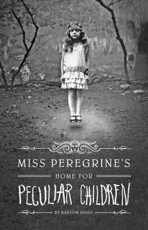
Review: Miss Peregrine's Home for Peculiar Children (Peregrine #1) by Ransom Riggs
Description: A mysterious island. An abandoned orphanage. A strange collection of very curious photographs. It all waits to be discovered in Miss Peregrine’s Home for Peculiar Children, an unforgettable novel that mixes fiction and photography in a thrilling reading experience. As our story opens, a horrific family tragedy sets sixteen-year-old Jacob journeying to a remote island off the coast of Wales, where he discovers the crumbling ruins of Miss Peregrine’s Home for Peculiar Children. As Jacob explores its abandoned bedrooms and hallways, it becomes clear that the children were more than just peculiar. They may have been dangerous. They may have been quarantined on a deserted island for good reason. And somehow—impossible though it seems—they may still be alive.
Stats: Young Adult Fiction Novel, 348 pages, First Published by Quirk Books, June 2011.
My Rating: 3 STARS
My opinions on this novel are somewhat of a mixed bag. Miss Peregrine's Home for Peculiar Children succeeds in peculiarity, but doesn't do as well in its consistency.
To start with, the idea of old photographs being used to build and illustrate a story is a really interesting concept that I absolutely love. Looking at an old and fading snap shot it's hard not to stop and wonder. Who is this person? What are they thinking? Why this moment? That little bit of curiosity gives us the opportunity to create a story for ourselves about what their life was like and who they were in that single second of time. The photographs in this book are interesting pieces in themselves, but the problem with this is that you can't show someone an image and tell them what they are supposed to see.
This is however, exactly what this book is trying to do. Telling me that this is a character, this is a mystery, this is real. Sometimes this method worked and I could see exactly what the author wanted to convey, but other times the photographs just didn't mesh with the story and my own vision. Personally, I was able to overlook the times this didn't work and enjoy the times it did, but it does complicate what the reader can and cannot support. If an aspect of the plot relies on me seeing a photograph in a certain way then it can easily bring me out of the story if I just don't go along with it. I have to give some credit to Riggs though. This was a ballsy concept and he does do a good effort to make it all work! It just depends on the individual reader to judge whether or not he succeeded.
The book started off really strong for me, I loved how we're introduced to our main man Jacob and his grandfather Abe. The story really stems from there relationship and propels the plot into the supernatural. The plot itself was very well paced with events constantly moving forward, but this sometimes made it harder to stop and get to know the characters. We don't get to know much about Jacob's personality beyond what is necessary for moving forward, but as a character he did a great job at keeping me invested in his journey. All the other characters had individual personalities and each added something different to the story. However, in a similar manner as Jacob, they weren't given a lot of time to get fleshed out as people instead of just plot points. I am pretty hopeful they'll come though better as the series progresses.
The supernatural elements of the story worked pretty well overall. I was able to follow the mechanics easily and as far as I can tell it all worked.
It was the ending of the book that lost a lot of steam. It didn't feel as serious of an event as it should have. Jacob had been doing such a good job emoting throughout the book that I didn't feel like he showed enough emotion when it really counted. As I started to see where things were going as more clues were revealed the storytelling seemed to suffer for it as it tried to bring drama to the final act. However, I still really liked where the story ended and I am looking forward to seeing what happens next. A lot could be done with this story and I think it would be great to see where it goes!
So yes, my feelings are very mixed on this one and because of that I'm not sure I would just recommend it to anyone. I still liked it and Riggs's writing is quite good but it is a book I can see being a different experience depending on the reader.
To give a better sense of the story I encourage you to check out the book trailer and see for yourself whether this might be the book for you.
Stats: Young Adult Fiction Novel, 348 pages, First Published by Quirk Books, June 2011.
My Rating: 3 STARS
My opinions on this novel are somewhat of a mixed bag. Miss Peregrine's Home for Peculiar Children succeeds in peculiarity, but doesn't do as well in its consistency.
To start with, the idea of old photographs being used to build and illustrate a story is a really interesting concept that I absolutely love. Looking at an old and fading snap shot it's hard not to stop and wonder. Who is this person? What are they thinking? Why this moment? That little bit of curiosity gives us the opportunity to create a story for ourselves about what their life was like and who they were in that single second of time. The photographs in this book are interesting pieces in themselves, but the problem with this is that you can't show someone an image and tell them what they are supposed to see.
This is however, exactly what this book is trying to do. Telling me that this is a character, this is a mystery, this is real. Sometimes this method worked and I could see exactly what the author wanted to convey, but other times the photographs just didn't mesh with the story and my own vision. Personally, I was able to overlook the times this didn't work and enjoy the times it did, but it does complicate what the reader can and cannot support. If an aspect of the plot relies on me seeing a photograph in a certain way then it can easily bring me out of the story if I just don't go along with it. I have to give some credit to Riggs though. This was a ballsy concept and he does do a good effort to make it all work! It just depends on the individual reader to judge whether or not he succeeded.
back cover |
The supernatural elements of the story worked pretty well overall. I was able to follow the mechanics easily and as far as I can tell it all worked.
It was the ending of the book that lost a lot of steam. It didn't feel as serious of an event as it should have. Jacob had been doing such a good job emoting throughout the book that I didn't feel like he showed enough emotion when it really counted. As I started to see where things were going as more clues were revealed the storytelling seemed to suffer for it as it tried to bring drama to the final act. However, I still really liked where the story ended and I am looking forward to seeing what happens next. A lot could be done with this story and I think it would be great to see where it goes!
So yes, my feelings are very mixed on this one and because of that I'm not sure I would just recommend it to anyone. I still liked it and Riggs's writing is quite good but it is a book I can see being a different experience depending on the reader.
To give a better sense of the story I encourage you to check out the book trailer and see for yourself whether this might be the book for you.
Friday, June 20, 2014
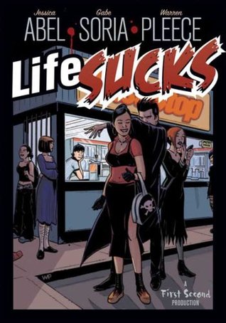
Review: Life Sucks by Jessica Abel, Gabe Soria & Warren Pleece
Description: Life sucks for Dave Marshall.
The girl he’s in love with doesn't know he exists, he hates his job, and ever since his boss turned him into a vampire, he can’t go out in daylight without starting to charbroil.
Stats: Paranormal Graphic Novel, 192 pages, First Published by First Second, April 2008.
My Rating: 2 STARS
Life Sucks is a graphic novel that sells itself as a possibly interesting take on another vampire tale of darkness. This story is all about removing vampire lore from its classic romanticism and into some form of reality where you need to pay rent and stuff.
All of the elements here are very workable concepts, and I went into this wanting to like it, but it just fell flat.
I don't really have much of a response to the book. No honest hate, no enjoyment, no emotional connection to the material, no interest in the art, and only mild interest in the plot. I can say that the characters were by far the best thing about the book, but even then they just weren't enough to carry the entire story.
What can be seen as the biggest downfall of Life Sucks was that it didn't do anything new. Everything done here feels done before. Nothing stood out and said, THIS SETS ME APART! And I hate to say that, because in a way it feels unfair to the book that I have to compare it to vast vampire sub-genre where it doesn't stand much of a fighting chance. (If only because everything has been done to varying degrees.) There are just better, more engaging books out there that have the same overall idea about taking vampires out of the dark age and into the modern world in the least sparkly fashion possible. A very, very good example of this re-imagining being American Vampire, a historical graphic novel which I highly recommend to anyone even remotely interested, if only because the art in that is remarkable.
Speaking of art. That was definitely my low point, and very nearly made me dislike this completely. I'll start by saying the art has really good things about it: The colouring is vivid, there are a lot of small details, and it has some great panels. But these things can't save it entirely. The style does not convey movement well and I found myself getting bored with the limited array of facial expressions. Worst of all, the inability to have characters appear to be more than just stiff re-positioned figures, reminded me of barbie dolls. That is never a comparison you want to think, let alone read in a review, but it has to be written.
When rounding everything out, this turned out to be very "meh".
Review: Whip It by Shauna Cross
Description: Meet Bliss Cavendar, an indie-rock-loving misfit stuck in the tiny town of Bodeen, Texas. Her pageant-addicted mother expects her to compete for the coveted Miss Bluebonnet crown, but Bliss would rather feast on roaches than be subjected to such rhinestone tyranny.
Bliss's escape? Roller Derby.
When she discovers a league in nearby Austin, Bliss embarks on an epic journey full of hilarious tattooed girls, delicious boys in bands, and a few not-so-awesome realities even the most hard-core derby chick has to learn.
Stats: Young Adult Novel, 234 pages, Edition Published by Square Fish 2011, First Published as "Derby Girl" by Henry Holt and Co. 2007.
My Rating: 4 STARS
After picking up the another ill fated YA derby focused novel, I felt the need for some more derby action. Of course, Derby Girl/Whip It was just sitting so precariously on the library shelf that I just couldn't help myself.
This book manages to be a combination of a lot of things that I love dearly: Roller Derby, Austin, Texas, Quippy Misfit Girls, and YA Shenanigans. However, it also has a couple things I don't love so much: Bad YA Parenting, Bitchy Popular Girl, Music Hipsters, and The Boyfriend Bait and Switch. So maybe it's a bit of a surprise that I ended up enjoying this as much as I did. The positives about this book definitely won out over the what has annoyed me so much in the past. I found that following along with Bliss was a really entertaining ride.
Bliss is our main dame and she is fabulous. Her narration is honest and easy to relate. Her story really had a way of coming to life because she felt like complete character in every moment. Bliss had a great balance of wanting to just fuck it by going against the grain and yet still feeling like she doesn't want to let people down or lie to them. I could imagine a real teenager acting and thinking just like she does. This feeling also extended itself to all the side characters. Each of them was an exaggerated personality, but I could still imagine them as real people. They were over-the-top, but never crossed the invisible line of believability.
This feeling of realism was also carried by the setting of the story. I am of the opinion that anything can happen in Texas and Austin is like my own little Wonderland. Anything that is unbelievable can be believed if only it's in the vicinity of Austin, Texas. ...Well, that may not necessarily be true, but I've got nothing to prove otherwise! So there.
Due to this book I was inspired to look into my local scene and almost everywhere has their own set up. Although I would never dream of slapping on a pair of skates myself because I have no sense of balance or coordination I am really interested in going to a bout and seeing what the room is really like.
But getting back on track, I didn't step away from this totally glowing. The story had an issue with flow. There was a couple of short snippet chapters about a third of the through that felt more like a montage of events then part of the continuous story. It was in these spots of "Quick! Move this along!" writing where Bliss's narration and characterization suffered.
My second problem was in the form of our boy meat, Oliver. I won't go into his plot line too heavily, as to avoid spoilers, but what happens there was a pretty obvious bait and switch. If this was the route that the story needed to take I only wish that it was done in a way that matched the clever tone of the book instead of making it so obvious.
There was also my list of general dislikes from above, where I also mentioned a few other things like the bad YA parenting, the mean girl, and the music hipster-ness, but I found these aspects of the story to have been handled quite well. They worked within the world that the book was presenting and actually made the plot better in some places. Although I still want to see these things stay out of my YA, if it works then it works.
Despite my complaints I enjoyed this book overall for what it was. It was light and fun, with a side of sarcasm, and I liked reading almost every minuet of it. Right now I'm on some sort of Roller Derby kick and reading this book made me wish that more YA would focus in on this special little world of girls kicking butt and taking names. If anyone has any roller girl recommendations be sure to let me know.
Some general information about the book, Whip It is a special case where the novel was originally published under the name Derby Girl. In 2009, when the movie adaptation of this book was released, the title was changed to Whip It. Both books are exactly the same content wise, but sometimes the distinction can get confusing. However, now that I mentioned the movie I just have to include the trailer. Oh Ellen Page, will you never quit being so cute? I certainly hope not.
Wednesday, June 18, 2014
Review: Batman: Harley & Ivy by Paul Dini, Judd Winick, Bruce Timm & Joe Chiodo
Description: The sexy, madcap super-villain duo of Harley Quinn and Poison Ivy plan to take down Batman once and for all. But first, Harley has to convince Ivy that she has what it takes to be a villain in Gotham City! This volume features a 3-chapter story written by Paul Dini and illustrated by Bruce Timm, the award-winning producers of Batman: The Animated Series, plus a story by superstars talents Judd Winick and Joe Chiodo.
Stats: Superhero Graphic Novel, 136 pages, First Published by DC Comics, June 2004.
My Rating: 1 STAR
The first thing you notice about this book is just how captivating the art is. The cartoon-y style grabbed me and the colouring made every page beautiful. Even when those pages were the equivalent of a wet dream, you know what I'm talking about. The suggestive poses, the spandex, the panties, the cat-fights, the cat-fights in panties, the naked shower cat-fights. You know, everything you want when it comes to the two sexiest characters in the Batman lexicon, Ivy and Harley.
Honestly, I love these two characters, they can almost do no wrong in my eyes. In the writer's and artist's eyes however, they can do a lot of wrong. (wink)
But you see, although I'm a girl who can appreciate other girls, I am also someone who loves strong female characters. This book however is not about strength or even strength in sexuality. Nope! This is about panties. That's it. No undertones, no story, just Harley and Ivy in various situations where they can disrobe. Batgirl even makes a brief appearance and gives us a great panel: knees together, ass up.
The terrible thing is, I could have really enjoyed reading an actual story about Ivy and Harley. I'm fine with sexy women, and I'm especially okay with my villains and heroes being sexy, BUT I draw the line between sexy and objectification, between sexy and substanceless. This is not how you treat women as complex and interesting as Ivy and Harley. They deserve better and so do I.
Tuesday, June 17, 2014
Review: 100 Years of Fashion Illustration by Cally Blackman
Description: A visual feast of 400 dazzling images, this is a comprehensive survey of the genre over the last century. This book also offers an overview of the development of fashion, as seen through the eyes of the greatest illustrators of the day. Early in the century fashion illustration reflected new and liberating currents in art and culture, such as the exoticism of the Ballets Russes, while the postwar period saw inspiration from the great Parisian couturiers. After the dominance of the celebrity fashion photographer in the '60s, a new generation of illustrators emerged, embracing the medium of the computer, while many returned to more traditional techniques.
Stats: Art Non-Fiction, 384 pages, Published y Laurence King Publishers, April 2007.
My Rating: 4 STARS
I just love looking at beautiful art! My love of fashion is directly influenced by my love of art. In my experience very little really separates the two and this book only cements that idea. It's this love of pretty things that has me addicted to websites like Pinterest, Style, and Etsy. While I'm among the few that are still clinging to my beloved fashion magazines trying to get past all the advertisements to the meaty bits for my couture cravings. Even with all the competition what has me loving 100 Years of Fashion Illustration is that here I got to see something entirely different then anything I've ever experienced with fashion. It's a trip through time and design as you're presented with all these amazing illustrations of beautiful women in beautiful dresses.
With each image there is also a little write up about the cloths, when it was drawn, by who, and for what purpose. It's great to see the illustration and then actually learn about the cloths being shown. It's more then what I expected! Attribution is one thing, but the research put into the cloths themselves is very interesting.
There are also full 4 page essays throughout the book that talk about the time periods giving us readers a look at the production, history, and specific events that influenced fashion.
I'm not all raves about this book though. The formatting was completely wasteful of the space it had and frustratingly so! It could have easily been better formatted to fit more into less space. One example is where there are pages with an image that takes up the top 40-50% of the page and then below it is half a page of white space. I could fit my whole hand laid flat across the page and not cover anything but the white space. This is more than enough room to work with. You don't want a book like this to feel too crowded, giving such beautiful work space to breath is a good thing, but you also want it to be an immersive and stunning experience.
This leads into my biggest complaint: the price. This is the sort of book you want to own and absorb inspiration from. I could picture this on my table no problem, even with my frustrations with the white space, but with a $50 Canadian price tag that definitely won't ever happen. I know table books generally go for a lot, but I've seen other collections like this one produced better and for less.
It's disappointing because I really did love the content of this book. It's was amazing to see the artistry that goes fashion and see the illustrations that just bring the cloths to life in a whole new way! But unfortunately, the devil is in the details.
Monday, June 16, 2014
Wandering Son: Volume 01 by Shimura Takako, Traslated by Matt Thorn
Description: The fifth grade. The threshold to puberty, and the beginning of the end of childhood innocence. Shuichi Nitori and his new friend Yoshino Takatsuki have happy homes, loving families, and are well-liked by their classmates. But they share a secret that further complicates a time of life that is awkward for anyone: Shuichi is a boy who wants to be a girl, and Yoshino is a girl who wants to be a boy.
Stats: School Manga, Volume 1, 208 Pages, English Publication by Fantagraphics, July 2011.
My Rating: 4 STARS
Wandering Son is a beautifully drawn hardcover manga, that feels a lot like what you would normally expect from a graphic novel. Whenever I think "manga", I think of things like Inuyasha and Fruits Basket, but among all the shojo and action fantasy romps we also have books like this one. Wandering Son is a quiet book. It's a slice of life look into the lives of two main characters, Nitori and Takatsuki. What makes this book unique is that Takatsuki is a girl who wants to be a boy and Nitori is a boy who wants to be a girl. The pair become fast friends near the end of their fifth grade year when Nitori becomes a new student. They don't know each others secret, but when the truth is shared, together they begin on a journey of self discovery and friendship.
I found this first volume really rather fascinating. The issues that face transgender people are complex and never before have I seen this complexity approached from the perspective of very young, young adults. Puberty is an awkward time for anyone, but what happens when you are experiencing all of those changes in a body that doesn't reflect who you are? Self discovery takes on even more weight when you're also reconstructing what gender really defines to who you are. What I really ended up enjoyed about Wandering Son is that this first volume didn't turn these events into huge melodramatic moments. As I said earlier, Wandering Son is very quiet, very restrained, and because of that these issues are presented in a very real and genuine way in moments of wanting, not dim the lights and play your violin sort of moments.
I know that this is a manga that I will become more and more attached to as I read on. However, that doesn't mean it didn't have some issues right from the starting gate. Confusion was my primary emotion for the first 80 pages. It was hard for me to keep track of the characters. There aren't that many of them, but because of the art style a few characters look very similar to each other. This manga also chooses to honour the norm in Japan that characters are referred to by their last names, which I've seen done before and can normally follow pretty well, but here this only added confusion. Trying to figure out who was who was hard at first, but it did get easier the more the characters interact and the character info page at the front of the book certainly does help. Also, as someone who has already read volume two, let me say this problem does begin to fix itself as the series becomes more confident in its characters and who they are.
I am very happy that I found this series and am really interested in seeing how the characters progress on their journey.
Subscribe to:
Posts (Atom)